Tuesday, January 11, 2022
 looking to purchase home accessories will have a new color option. Described as a shade of blue with violet-red undertones, Very Peri is Pantone’s 2022 Color of the year. The hue, which is expected to be on trend in products that range from home furnishings to runway fashion, is getting mixed reviews from local designers.
“I think Pantone picks wild colors on purpose to spark some conversation. If they picked a boring beige no one would talk about it.”
— Ashley Hollings, interior designer
“Very Peri isn’t a color that I would choose often, or recommend to clients frequently, but I can see why some people would love it,” said McLean designer Ashley Hollings,
“I may be in the minority, but I think it’s a beautiful color,” said North Potomac designer Dana Wiseman of Wiseman Designs. “However, I don’t think I’d recommend it to a client. It’s a bit too dark for an interior.”
“As a purple with a blue edge, Veri Peri is cold and bold,” said Annie Elliott of Bossy Color and Annie Elliott Design “It's a strong, impressive color, but it isn't welcoming and that's the number one word my clients use when describing their ideal home.”
There are those aren’t afraid to embrace it, says Cathy McNamara of Dream Interiors in Alexandria.“I’m seeing an uptick in the number of homeowners and designers who are taking risks. Veri Peri is definitely risky,” she said. “This was once a color that was only used as an accent, but more and more of my clients are choosing bold colors for whole rooms.”
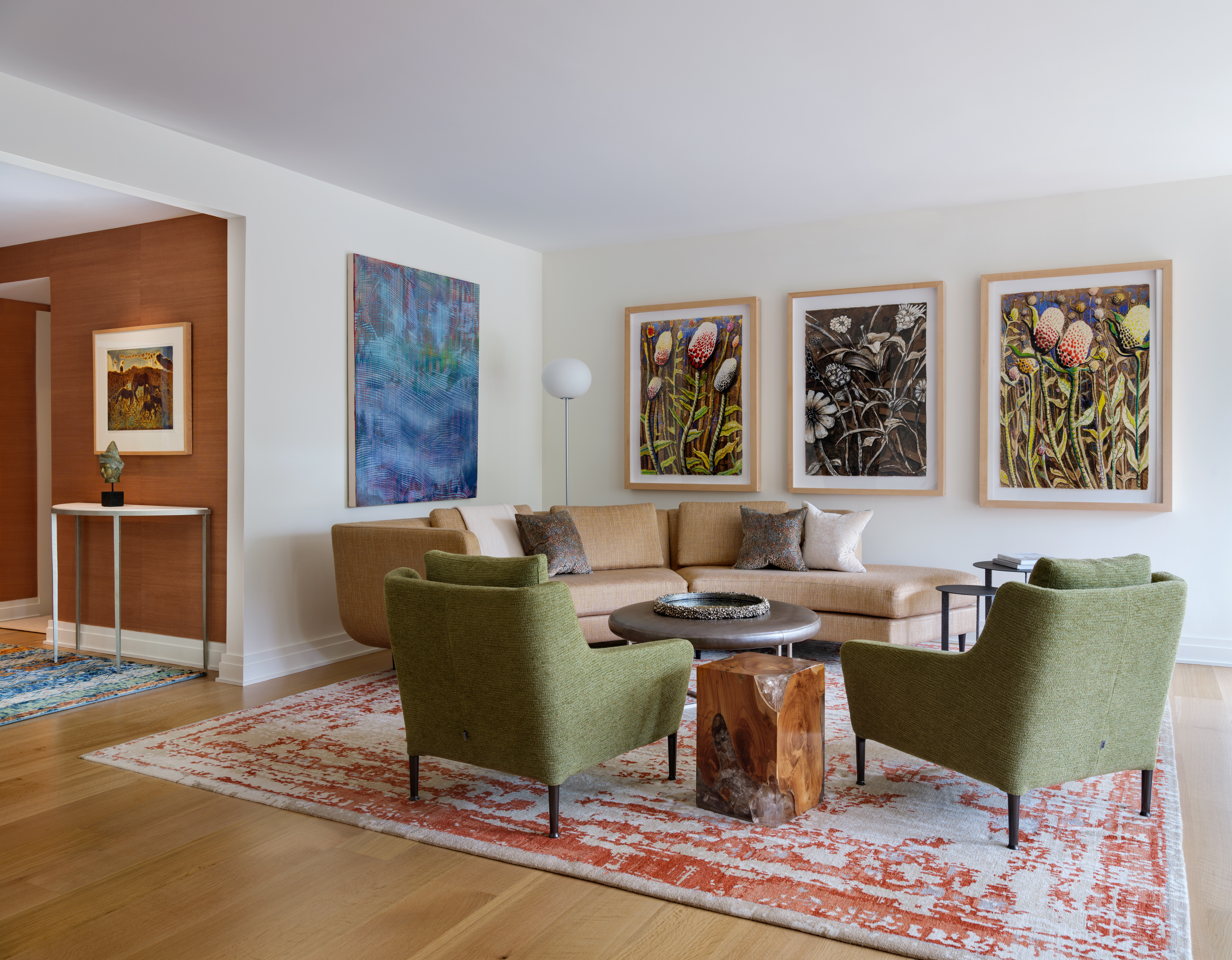
Those who find the color appealing, but want to use it with caution. Veri Peri can add a burst of vibrancy to a neutral interior.
"As a solid color, it would look great on lamps or a quilt in a crisp white bedroom,” said Elliott. “It would be a dramatic accent color in an extremely contemporary home, and the only accent color, possibly. It would be effective as a splash of color on pillows, vases, and art.”
Though considered by designers to be a vivid hue, Veri Peri can be paired with colors to increase or subdue its vibrancy. “You can pair it with neutral colors like beige or white to balance the shade and provide a calming, comforting effect,” said interior designer Michelle Zimmerman of Potomac.
“If you want to make more of a statement, pair it with oranges or yellows, which makes the purple hue pop and appear more vivid,” continued Zimmerman. “They’re complementary and will create a bold statement.” “To tone down the boldness of Veri Peri, I would pair it with adjacent colors such as red, burgundy, and navy blue,” added Elliott. “The cleverest thing about Veri Peri from an interior design perspective is that it will look great with cool gray.”
For the past 23 years, experts from the Pantone Color Institute forecasts global color trends and select a Color of the Year.
“I think Pantone picks wild colors on purpose to spark some conversation,” said Hollings. “I mean if they picked a boring beige no one would talk about it.”